So i guess this is my last blog :( I definatly learned a lot in this class and for a 7:30 class i actually enjoyed it! crazy i know...i have already applied what i have learned from this class to projects outside of Illustration and i hope that i will do it again..and in a business setting :) so this is farwell...but not really cause i will be around for at least 2 more years! get excited
-Rebecca Greiner
Monday, December 13, 2010
Friday, December 10, 2010


Red barn illustration
This illustration is probably in the top two of my best work. I thin I demonstrate a good use of line and wash together. I have already made a review of this piece because I used it as my best piece for my midterm portfolio. Even though this was done a while back I still think it to be one of my best pieces. That doesn’t mean that I haven’t gotten better. I just don’t think that you can beat an ah-ha moment :)

Three image gouache montage
This is my best piece so far this semester. I think the tiger reads really well. The colors make it pop out to seem 3-D. I think that if there is one thing that I could have done better with this piece is that I should have worked on the telephone more. The chord of the telephone is looser than the tiger and I feel like the overall style of the three pieces don’t match, but I like that part in a way because it makes the composition unique.


Great Gatsby girl
I started over on this piece so many times that I can’t keep count. I do like the way that it eventually turned out. The face and skin overall looks realistic and I’m very proud of the way I constructed the hand. I did add line to this illustration, however its done on the computer…sorry Rusty, I still am afraid of drawing line L its so …permanent.

CD cover album
I enjoyed the way this turned out, but just like the Great Gatsby girl I started over a million and one times. The only illustration I did on paper was the girl, and everything else was done in photoshop. I picked this piece because I like that overall layout of the album and it reads well. If I could do something differently I would add more elements in and possibly made the background wash.

Technique drawings
There are 4 different techniques that we practiced a lot in class. Line, line/wash, wash, and line work on the computer. I picked some from each category that represent my best work on these different techniques. I picked my picture of the bike that I drew on the computer because I played with line width, line opacity, and different line textures.


I think that my line drawings on paper are the best. It’s weird because I was so comfortable with line at the beginning of the semester…but lately I’m afraid of it!!! Anyway…I picked these drawings because they demonstrate confident mark making. On most of them I used different width strokes and I found that to be very effective. In the lake scene and the pinecone, the shading with hatching reads well.


My favorite technique is wash. I hated watercolor at first, but I guess Rusty was right, with a little practice it becomes your friend. I chose the crazy sky because it shows the way that watercolor can react with paper. It’s not necessarily done well and it’s not really a picture of anything but it’s a good example of how you can manipulate watercolor. The house is one of my earlier pieces, but I like it nonetheless. I enjoyed playing around with the different strokes that I could make with watercolor. I like the way the shadows in the house read and I think that it makes for an interesting piece.


. Lastly are my line/wash examples. I like the flower because I drew it with line first and added wash later. The wash goes beyond the line and I like the style. The hot air balloon is the opposite; I did the wash first and then added the line. It’s a lot tighter and even though I don’t like that technique I think that my balloon is a good representative for it.
I say like WAY too much in this….
Sunday, November 7, 2010
Three Image Gouache Montage

Friday, October 29, 2010
Product Illustration

Wednesday, October 20, 2010
The good, the bad, and the ugly - midterm portfolio

my ah ha moment and my best water color yet!!! i love this piece and im so proud of it for many reasons. first of all i love the way that i used the right amount of line and wash. im finally comfortable with line! also i like the way the watercolor formed on the wagon. i used more confident strokes and it turned out great. i was trying not to be so tight in this piece and it shows in the boy's hair and in parts of the wagon where my paint goes beyond the line. so tada!! my best piece :)

Monday, October 18, 2010
Final Red Barn Brochure


this is my final layout for red barn arts and crafts festival :) i really like how it turned out....i wish i had more illustrations but i know rusty only said 2....but it looks bland so i think more illustrations might help with this....but i like it!!!!!
Friday, October 15, 2010
Ah Ha!...?


These are my watercolors for the Red Barn Arts and crafts festival pamphlet. i think that i had my AH HA moment!! :) about time! im really proud of the way that i used line in all of these...i have confident mark making. also i think what made these pieces really good was that i was that i had an even amount of line work with watercolor. and i wasn't too tight :) yay for my ah ha moment!
Wednesday, October 13, 2010
Ryle Hall Mural

i know i know this is not as detailed as it should be but it gets the message across. its all about different culture's food and how we serve that here at truman. :) yay!
Wednesday, October 6, 2010
New watercolors!


These were just 8 X10 watercolors...trying new techniques and playing around....i dont like my flowers....i was trying out glazing..BAD idea :( but i do like my fish...if only there was more line work...maybe ill kick it up and but another picture of it back up...eventually :)
Wednesday, September 29, 2010
Illustration for event poster

Monday, September 20, 2010
Self portrait
A portrait of myself in watercolor!
this portrait wasn't approved for printing because it was very light on line work...i think im scared of line :( i was very proud of this and i think that it looks good...we'll see what happens when i add more line...

Friday, September 17, 2010
Line/Wash...Wash/line
i think things are finally looking up! these turned out really good for me :)
i certainly like the Line/wash better...it gave me more structure


i certainly like the Line/wash better...it gave me more structure


Wash/line.....check out the cookies! they're my favorite


Watercolors in class
These watercolors were done in class. we upscaled our 5X7's to 8X10's
i think im getting better!
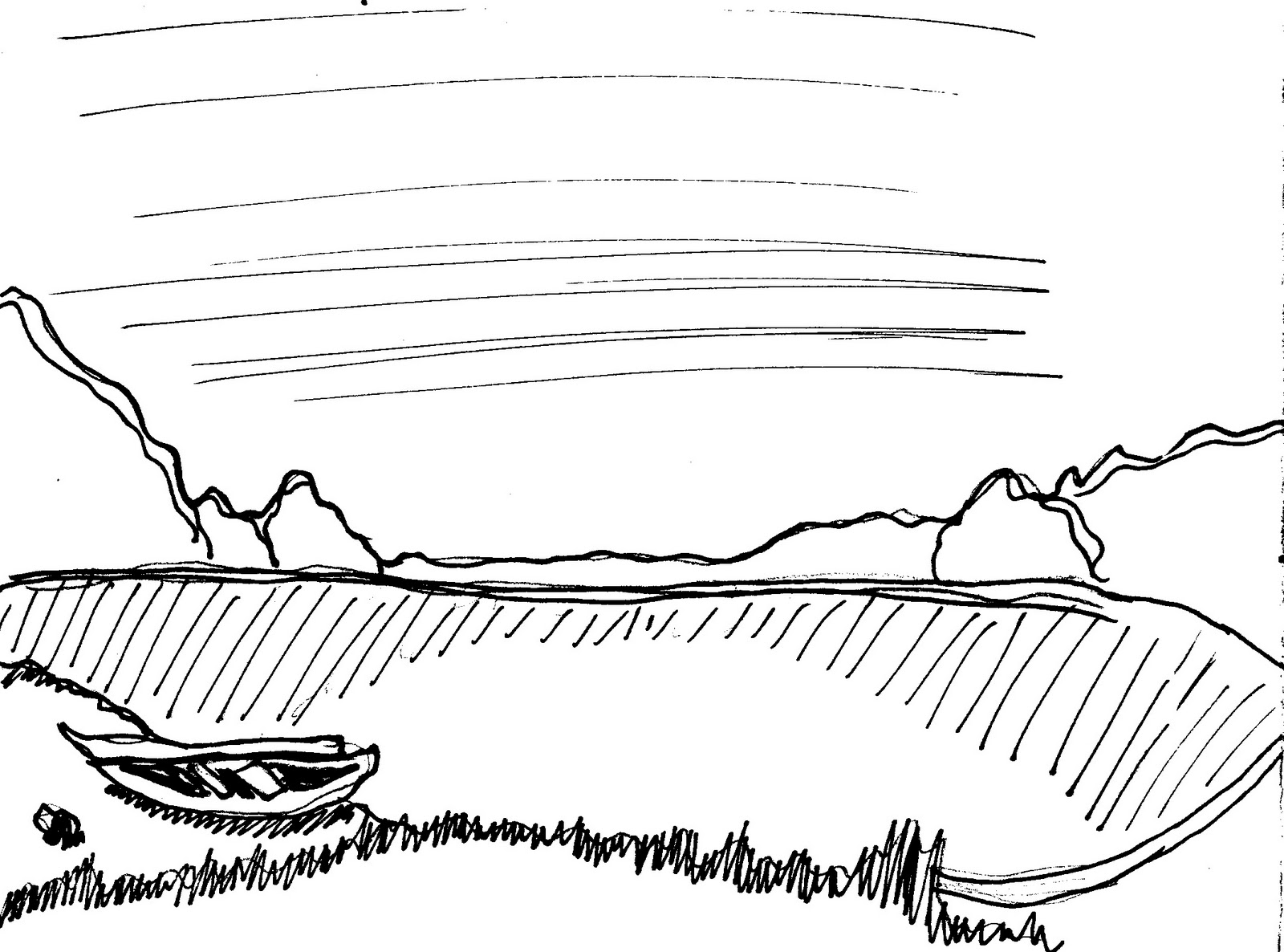
the house picture im really proud of and also the sunset on the beach...very loose and it works well...dont you think?


i think im getting better!
the house picture im really proud of and also the sunset on the beach...very loose and it works well...dont you think?


10 City scapes
These next ten were more structural and they were city scapes. i dont like them very much...i dont think i have my ah-ha moment yet...its coming soon...promise.


Subscribe to:
Posts (Atom)