Wednesday, September 29, 2010
Illustration for event poster
This is my horse poster advertising the equestrian team. i do like it, but i think i may have overworked the line. it was really difficult to work on illustration board because it was very stubborn in the way that i couldn't pick out color or blend very well...overall i think that it could be better but i do like it.
Monday, September 20, 2010
Self portrait
A portrait of myself in watercolor!
this portrait wasn't approved for printing because it was very light on line work...i think im scared of line :( i was very proud of this and i think that it looks good...we'll see what happens when i add more line...
Friday, September 17, 2010
Line/Wash...Wash/line
i think things are finally looking up! these turned out really good for me :)
i certainly like the Line/wash better...it gave me more structure
i certainly like the Line/wash better...it gave me more structure
Wash/line.....check out the cookies! they're my favorite
Watercolors in class
These watercolors were done in class. we upscaled our 5X7's to 8X10's
i think im getting better!
the house picture im really proud of and also the sunset on the beach...very loose and it works well...dont you think?
i think im getting better!
the house picture im really proud of and also the sunset on the beach...very loose and it works well...dont you think?
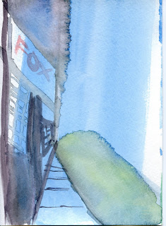
10 City scapes
These next ten were more structural and they were city scapes. i dont like them very much...i dont think i have my ah-ha moment yet...its coming soon...promise.
Watercolor!!
These were my very first watercolors. :) Ten simple sky scapes!
i love watercolors, they are very fun...i enjoy playing around with all the color
i love watercolors, they are very fun...i enjoy playing around with all the color
Subscribe to:
Comments (Atom)


