


Red barn illustration
This illustration is probably in the top two of my best work. I thin I demonstrate a good use of line and wash together. I have already made a review of this piece because I used it as my best piece for my midterm portfolio. Even though this was done a while back I still think it to be one of my best pieces. That doesn’t mean that I haven’t gotten better. I just don’t think that you can beat an ah-ha moment :)

Three image gouache montage
This is my best piece so far this semester. I think the tiger reads really well. The colors make it pop out to seem 3-D. I think that if there is one thing that I could have done better with this piece is that I should have worked on the telephone more. The chord of the telephone is looser than the tiger and I feel like the overall style of the three pieces don’t match, but I like that part in a way because it makes the composition unique.


Great Gatsby girl
I started over on this piece so many times that I can’t keep count. I do like the way that it eventually turned out. The face and skin overall looks realistic and I’m very proud of the way I constructed the hand. I did add line to this illustration, however its done on the computer…sorry Rusty, I still am afraid of drawing line L its so …permanent.

CD cover album
I enjoyed the way this turned out, but just like the Great Gatsby girl I started over a million and one times. The only illustration I did on paper was the girl, and everything else was done in photoshop. I picked this piece because I like that overall layout of the album and it reads well. If I could do something differently I would add more elements in and possibly made the background wash.

Technique drawings
There are 4 different techniques that we practiced a lot in class. Line, line/wash, wash, and line work on the computer. I picked some from each category that represent my best work on these different techniques. I picked my picture of the bike that I drew on the computer because I played with line width, line opacity, and different line textures.


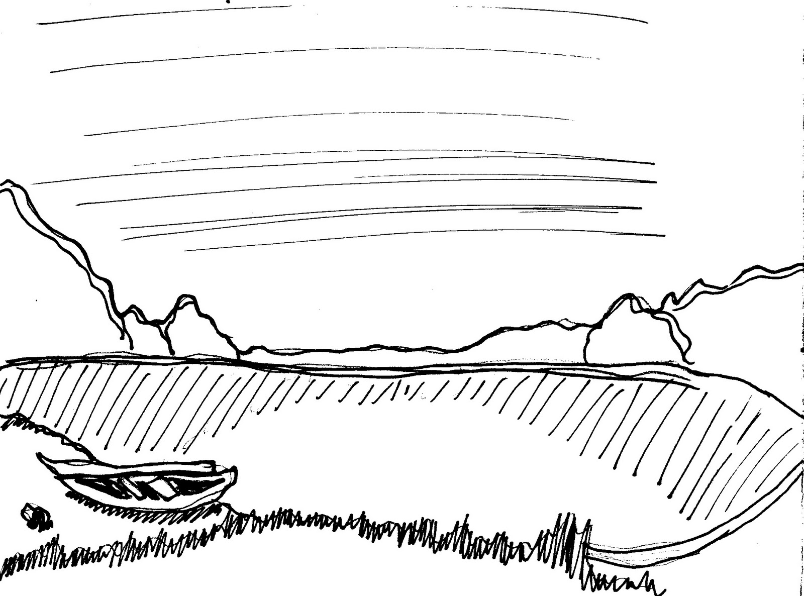

I think that my line drawings on paper are the best. It’s weird because I was so comfortable with line at the beginning of the semester…but lately I’m afraid of it!!! Anyway…I picked these drawings because they demonstrate confident mark making. On most of them I used different width strokes and I found that to be very effective. In the lake scene and the pinecone, the shading with hatching reads well.


My favorite technique is wash. I hated watercolor at first, but I guess Rusty was right, with a little practice it becomes your friend. I chose the crazy sky because it shows the way that watercolor can react with paper. It’s not necessarily done well and it’s not really a picture of anything but it’s a good example of how you can manipulate watercolor. The house is one of my earlier pieces, but I like it nonetheless. I enjoyed playing around with the different strokes that I could make with watercolor. I like the way the shadows in the house read and I think that it makes for an interesting piece.


. Lastly are my line/wash examples. I like the flower because I drew it with line first and added wash later. The wash goes beyond the line and I like the style. The hot air balloon is the opposite; I did the wash first and then added the line. It’s a lot tighter and even though I don’t like that technique I think that my balloon is a good representative for it.
I say like WAY too much in this….
No comments:
Post a Comment